Craft + Keen Rebrand & Webdesign

Branding to the user experience end results
This project was a very broad project including the logo redesign and the user experience design. Toronto based digital marketing agency, Craft + Keen wanted to rebuild their brand identity with various experiments, stepping further with a creative approach with the thoughts that it was very important for them to stand themselves out from the numerous creative agencies from the industry.

How to rebuild their brand with the better-looking logo?
It was very important to include the ‘personality’ of the agency. The logo that they have was very old-fashioned and lacking consistent looks in various materials & platforms. The grungy texture was distracting the message what they want to deliver and typography & colour usage was also very inconsistent. the main challenge was ‘how to make the logo aesthetically pleasing, but delivers a clear message at the same time.’

Building a temporary website before delivering the final portfolio
The first request for this project is to build a temporary website based on the current design looks before starting to build a new brand identity. 4 variations/versions were created to represent the company’s looking field but with subtly different elements and concepts. the design is starting from the very minimal looks with less visual creatives and texts and the last one ends with very ‘out-of-the-box’ looking design with lots of visuals included.


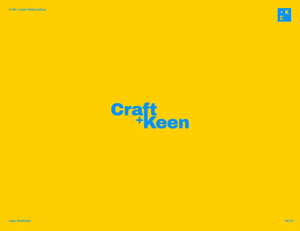


How to utilize the colour and typography in order
to deliver the logos with various concepts?
After working on the temporary website rebuild, the main task was launched with 12 different logo ideas pitch. each one of the logos illustrates different looking fields with the various usage of colours and typography; from very fun and exciting looking fields to more sophisticated and corporate looks.


Final Look of the logo
It was very important to include the ‘personality’ of the agency. From the name ‘Craft + Keen’, Craft illustrates hard works and craftmanship whereas ‘Keen’ stands for insightful, psychological, and interaction with others. With the combination of those two key facts, The final redesigned logo was reborn. the overall look is not very different from the old logo but with the clear hierarchy and typographic system, the logo looks very clean and also includes the enough breathing spaces. Two different colour tones (Blue & orange) were used as representing of Craft, and Keen with a monotonic looking feel.
After working on the temporary website rebuild, the main task was launched with 12 different logo ideas pitch. each one of the logos illustrates different looking fields with the various usage of colours and typography; from very fun and exciting looking fields to more sophisticated and corporate looks.


Expanding further to another printing materials; Flipbook
As in an expansion of the business card, I also created the flipbook containing various information including their mission statement, contact information, and many others. the design patterns were derived from the logo gird and contains lots of more creative elements.


Building the new website as a next step
The project is still in the process but the overall look for the website will be simple, clean and shows a clear message of what the ‘Craft + Keen’ agency is. the mockup shows a hero image of the main page of the website.