The Labyrinth Magazine
Arts and illustrations book inspired by Wired magazine.
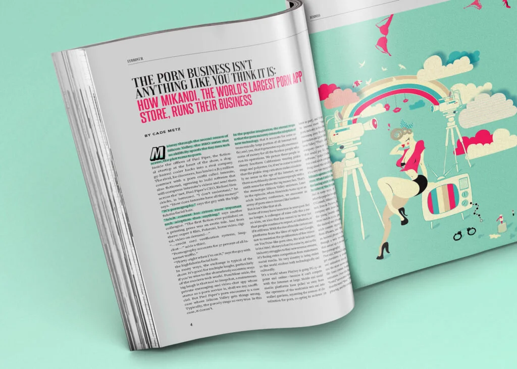
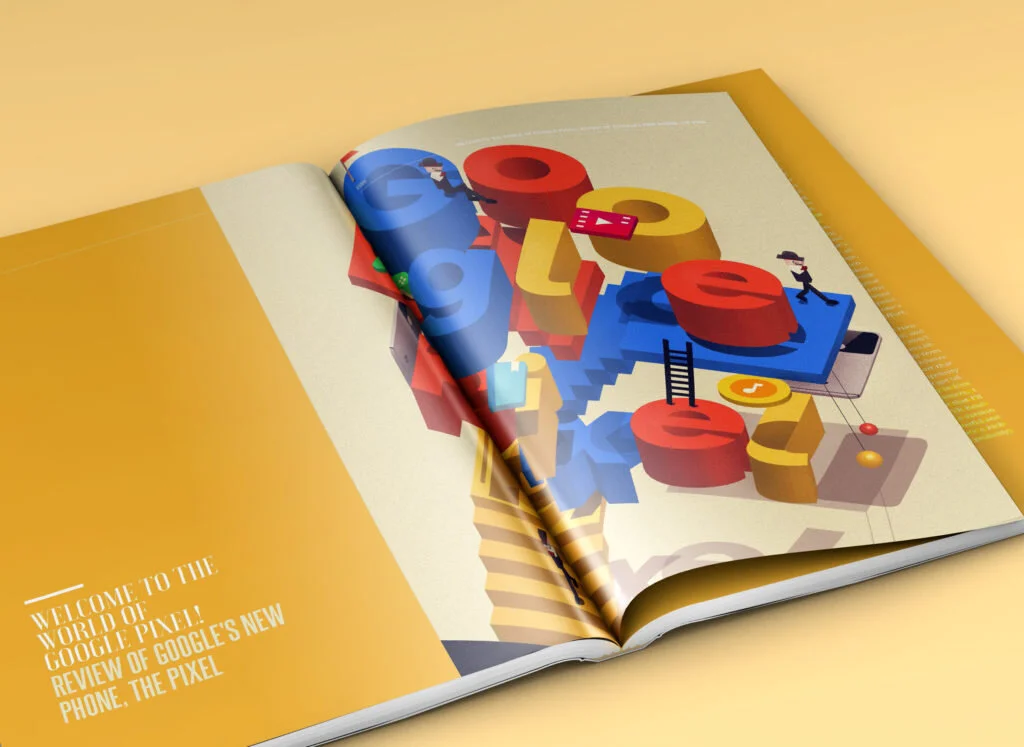
The name of the magazine is called ‘Labyrinth’. I divided the contents into 3 main different parts which are ‘Business’, ‘Design’, and ‘Technology’. The articles inside each content include the regarding topics. The concept behind of the magazine tells people who work for those three different fields to connect & interact with each other in order to form a better-structured world just like how the labyrinth forms itself. Every articles and illustration works are based on these following stories and concepts. Illustration artworks visually describe the contents of the article and tell the preview stories what will the article cover. From the very first title page to the last page, the magazine tells the story how people interact to form the world of the labyrinth.
How the overall design achieves its objectives with the keen use of colour & Typography.
Overall, strong and deeply saturated neon colors were illustrated by showcasing lots of different styles of illustrations and by that, pursuing a larger number of audiences, who also prefers various styles.
This magazine is the editorial design piece and shows a lot of typographic elements. consistent typographic styles were being used for the headings, subheadings, contents titles, body types and etc. Also as a part of each illustration work from the book, various typographic elements were used in order to achieve a better understanding of what each artwork stands for and to make them much more appealing.