AMERICAN AIRLINES
Redesign the mobile flight
booking experience
The newly designed American Airlines application aims to provide simplified usability to win over bookings made on desktop
In this case study you can follow along how we alleviated the most crucial pain points that mobile users experience when booking flights with mobile.
TEAM MEMBERS
Harry Kim - UI/UX Designer
Aaron Liu - UI/UX Designer
TOOLS & METHODS
Competitive Benchmarking, Usability Testing, Affinity Diagram, Empathy Map, Journey Map, User Flow, Visual design
TOOLS
Figma, Invision, Photoshop, Illustrator
TIMELINE
April - June 2021, 2 months
CLIENT
Academic
AWARDS
GCU: Graduate with honor
Problem Overview
Despite tremendous proven usage of mobile websites & applications compared to desktop sites due to its benefits of being portable and intuitive, desktop usage still exceeds mobile usage in flight booking. Considering American Airlines is one of the world’s largest airlines, with nearly 154,000 online flight bookings made per day, I decided to research its mobile app to find out what causes this usage gap with a booking made on desktops.
We believe there need to be some ongoing usability issues when booking via a mobile, and finding those problems and providing solutions accordingly would be the only way to turn these stats upside down.

We started off with a market research
Keeping in mind the importance of understanding the user’s general experience with the many flight booking applications in the current market, we decided to conduct competitive benchmarking and examine four other Airlines applications with the equivalent number of user base and commonly shared flight regions as what American Airlines cover. (three airline apps; Ryanair, Delta, Lufthansa & one flight aggregator app; Skyscanner) The goals were:
1. Understand what they are doing well
2. Understand where they were falling short
3. Understand the relationship that user has with each of the airline and their mobile applications
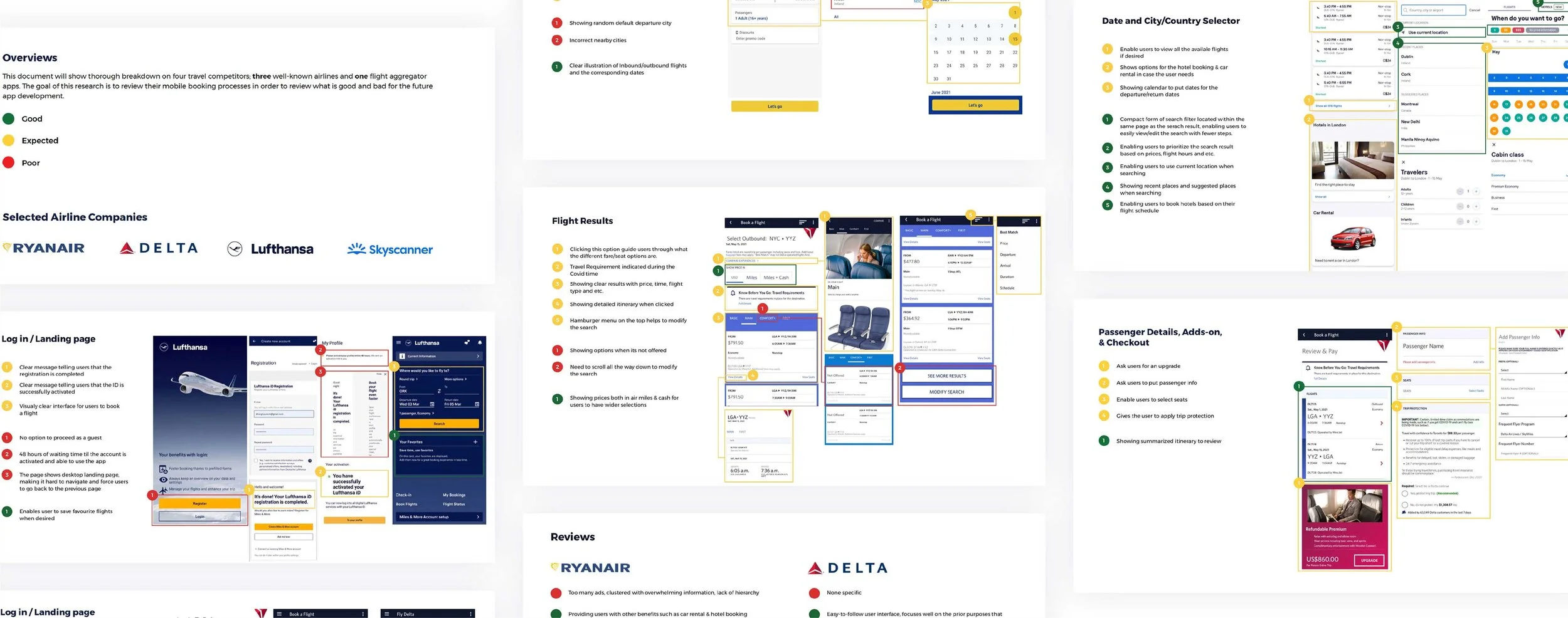
Key learning points
When conducting Competitive Benchmarking as my foundational research, we tried to consider ourselves as user personas to really be in user’s shoes. We were able to find some key insights including, First, most of the products were not very intuitive. Second, on both the micro and macro levels, we often found it confusing about what we are supposed to do, when to do it, and where to find the information we needed when booking flights.
Here are what users said
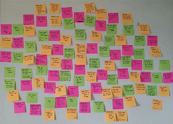
We then conducted usability testing to see if my assumptions align with what users feel with the apps that we have examined from the benchmarking.
To draw a wide and unbiased spectrum of conclusions, the test was conducted with three interviewees of different ages and occupations, and their context and the frequency of booking a flight varied (Book flights for business vs Leisure purpose), we assigned them to complete the booking and all the observation were taken as a comprehensible notes.

Key learning points
Usability testing is truly valuable as we could validate and align our assumptions with real user painpoints. Overall, the users are experiencing frustrations in many areas during the testing including unclear payment info, excessive amount of pop up ads, not having options to skip through extras, unclear screen indication and such.
Organizing ideas
Although we did gain a lot of useful information about users’ relationships with the current apps in the market, we felt the need to organize all the clustered ideas into more digestible output to drive solutions efficiently. In that sense, the Affinity Diagram was a perfect tool.
The goal was to review competitive benchmarking document, survey results, and usability test recording to put structure on qualitative research data collaboratively with my teammate Aaron and align with his finding.
The final themes we collected were:
1. Summary
2. Progress bar/ navigation bars
3. Behaviours before choosing an airline
4. Contextural information
5. User Goals
6. Search area
7. Pain points
8. Mental models
9. Home page
10. UI
11. Calendar
12. flight results
13. Usability
14. Behaviours on airline apps
15. Flight details
16. Payment
17. Wording on CTAs
18. Sharing information before booking
19. Other (needed more info)

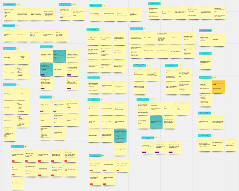
Some drawn Insights from each themes
1
For some users, they wanted to skip the ‘Extra Add -ons’ screen, an insight is: users need a way to skip the ‘Add on’ stage if not needed.
2
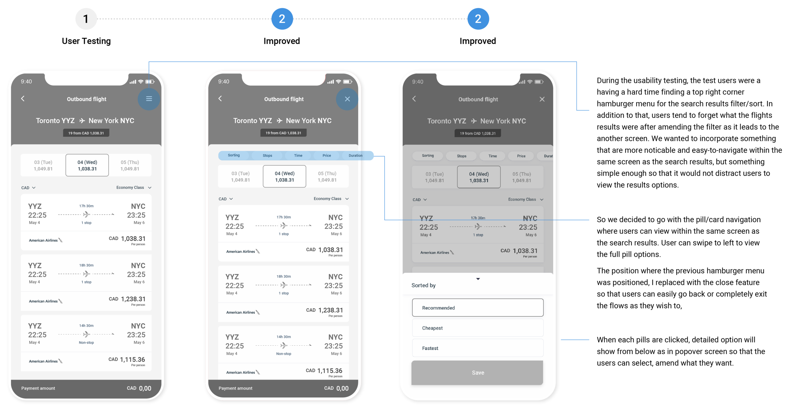
The search filter navigation on the top right corner was difficult to find for almost all users, an insight is: users need more intuitive way to access search filter/sorts settings.
3
For most users, it’s not immediately clear how to go back to the previous screen, an insight is: users need better cues to easily navigate one screens to another.
4
Not everyone is familiar with the term ‘Economic Flex’ when selecting different fare options, an insight is: use accessible language or explain clearly what ‘flex’ means
Mapping the user journey
Then, we translated all the collected data into a journey map to navigate how users interact with each every touchpoints of the booking stages, and asked myself, ‘how do I improve the current journey to be more effortless and seamless?‘

Key learning points
As all the real research driven data was used to build the journey map, we did not have to make lots of assumptions. The key takaway from user journey map is to see things through the eyes of an outsider and highlights aspects of the journey that needs to be fixed as a priority.
Dissecting the problem
After gaining a better understanding of users current experiences and their painpoints when booking flights via mobile, we found key problems that fall under four main categories, which are,
Difficult to navigate
Lack of visual & typographical hierarchy for each screen massively confused users from understanding which booking stages they are in. This makes users hard to navigate through the steps and recall what the previous screens indicated, making them go back to prior screens often to double-check if they are on the right track.
Too much distractions
The airline’s attempt to jam up too many pop-up ads, images, and promotions caused huge irritation and confusion of the users and distracted them from pursuing the primary & simple goal; booking a flight.
Unfamiliar mental models
Having used computers for booking flights for many years, users are generally reluctant to use their phone to make a booking, especially considering the context of booking, where they are usually accessible with their laptop or computer in their office or home.
Overwhelmed
Users desire to focus on completing single tasks per each screens when using mobile. Pushing users to input too much information or to take too many actions at once in a very compact mobile space overwhelms users.
REFRAMING A PROBLEM STATEMENT
“How might we design a simple & easy-to-follow flight booking flow via mobile?”
Some possible solutions include:
1. Remove excessive advertising and focus on providing minimized but intuitive travel deal offers.
2. Guide users through the booking process with clearer screen indications and instructions.
3. Give instant feedback to affirm/correct user input.
3. Allow users to focus on completing single tasks granularly for each stages instead of throwing information at once.
4. Build a cohesive design system to make the interface easier to navigate.
5. Add more visual narratives to bring excitement to the users during the journey.
Core Task Flow
The core flow of the application was simple, booking a flight. we decided to go with a simplified task flow of the process for efficiency. I started to create the user flow to allow users to flow through the app towards their final destination as smoothly and easily as possible.
Defining Information Architecture
Majority of up-selling travel deals were removed and minimized and was put under ‘Home’ as ‘Todays Offer’. the app itself focuses more on primary use of booking a flight but also enabled users to check their millages and past & current trip information.
Iterations & Adjustments
After sketching out some core screens, I created a first level of wireframes to validate the design layout with my users. My test users found it hard to navigate the two parts, which was the search results filter/sort and the flight fare detail displays.

Finalized Medium-Fidelity Wireflow
After usability testing sessions, I consolidated all the feedback and came up with refined medium-fidelity designs for the product. Then I grouped and linked each screens by particular tasks and rearranged them to complete the flow of booking a flight.

Visual Design & Moodboard
With the established wireflow, the final step of the design stage was to build UI side of the product by adding design components to set out the new look and feel, and creating a mood board made it easy to communicate the ideas and inspiration behind a future design.
The new brand identity has simple, clean, and modern look, aligns with credible & cordial personality. While keeping the red and blue duo-toned theme, the new color palette shows more flat and saturated look with the usage of refined sans-serif font, Roboto bold & regular. The geometric shapes extracted from the logo were used as diverse design elements including icons and patterns to add more narratives into the brand.


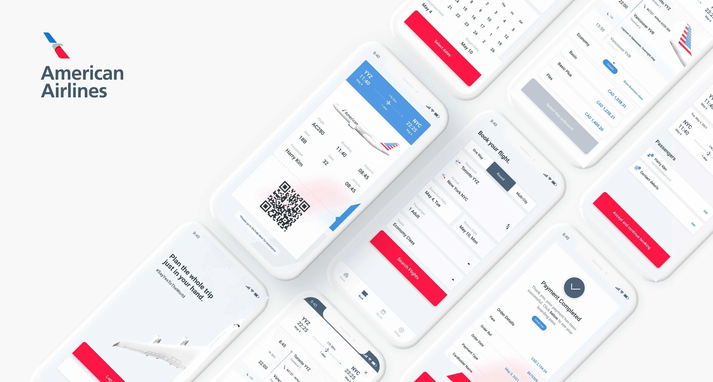
The final solution
After establishing visual design elements, I came up with high-fidelity designs for the product. I created the logo, branding, 3D illustrations, and the colour scheme for the mobile application.
Log In & Home
A familiar mental model of landing & log in screen was kept, tone of voice is cheerful and assuring, users can proceed booking flights by accessing bottom navigation which displays 4 destinations with both icons and text labels.
Search Flights
Simple and straightforward screen interface with the usage of newly designed iconography, and introducing popover screen from the bottom when a user clicks on control buttons within a defined area.
Search Results (Outbound & Return)
Flights results were shown as separate cards and were ordered by price as default, yet, enabling users to change easily with floating filter navigations on the top. When a user clicks each options, the flight itinerary shows up in detail and users are able to compare/select different fare options.
Input Passenger Info
After selecting flights, users are guided to confirm itinerary and input passenger info by entering texts into the text fields. The state of the button stays inactive until the form is completed to help users to understand what the required action is. Upon completion, the Passenger blocks change their appearance with visual cues, allowing users to move forward to the next steps.
Seating & Baggage
With removal of all the other unnecessary add-ons, seating and baggage options are compressed in one screen. The bottom message indicates the following screen is optional, providing options for the user to skip through if preferred.
Payment & Boarding Pass
Users are able to add/input payment options within the 4 options suggested. Thorough fare breakdown is shown on the bottom of the screen to cause no confusion. Upon payment completion, users will access to the boarding pass accompanied by intriguing visual elements that bring excitement.

What are the next steps?
How Do I Ship to the Market?
If we were to develop this and ship it to the market, we would like to track engagement and time spent in the app.
A developed marketing website or an app store page may include strong value proposition to resonate with the target audience. We believe Incorporating features such as testimonials, press features and a vision of what pricing for this service will be for the future monetization will foster trust in our brand and conversions.
Consider Edge Cases
Only having focused on the happy paths and setting aside the possible edge cases and technical constraints, we missed the chance to think of other scenarios. By asking ourselves, ‘what if the user wants to pause during the booking stage and wants to come back later? ‘What if the user wants to book the same flights that were previously booked, but with different dates? ‘ This required to re-evaluate, identify the priorities of our features, then narrow it down.My Personal Takeaways
Communicate and communicate
As it was my first time working with my teammate Aaron, I wasn’t sure where to start as we have different schedules and work style. By communicating our thoughts, feelings, and empathize with one another, we became a great team. As we work together further, I keep in mind the way he do his work and how his design thinking skill is, so communicating with him felt easy as we move forward.
Adapting to Uncertainties
Working on this case study have taught me to think and act quickly in adapting in changing environments, and really embrace the unknown and plan again accordingly. The process is not linear, and it takes patience and appreciation for uncertainties. Such includes constant iterations, unexpected additional workload etc.